�n�J
�U
���U
�U
�|������
�U
���b
�U
���V�ҵ{
�]�k�̤l
�U
�۸�X��
�U
�q�l��
�U
�ȪA����
�U
���z�����^�|��
�ѦW
�X����
�@��
isbn
�s��
5050�]�k���w
|
NG�ѫ�
|
��گū~�P�ҵ{
|
�u�f�q��
|
�R�E�^�����ֺ��
|
�����_�۳Ч@�]�p��Ų�G���R����ا@�~��(�H�Ѫ���DVD���СB�Ѹy�����)
���@�̵L�������y
��Ǥp��
���
�U
�p��
�ӺЧ�
�]�g���
�U
��P����
�H�����{
�v�СB����
���|�B�H��B�v�a
���N�B����
�U
�q�v���@
�y�Ӿi��
�����B�O��
�Ʋz�B�ͬ��ʬ�
�Ш|�B�߲z�B�y��
�i�Dz�
�q���P����
�U
�y���u��
���x�B���Z
�U
�x�F�B�k��
�ѦҡB�ҸաB�Ь�ή�
��Ǥu�{
��ǡB�۵M
�U
�u�~�B�u�{
�a�x�ˤl
�a�x�B�ˤl�B�H��
�C�֦~�B����
���֤Ѧa
�ȹC�B�a��
�U
�T��
���e�B����
�U
�����
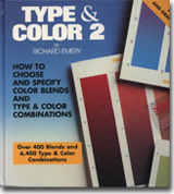
Type & Color 2�GHow to choose and specify color blends and type & color combinations
�@�̡G
Richard Emery
�����G
���N�E����
��
���
�X�����G
�_�P
�X������G1994/1/1
���y�s���Gbk0011805
���ơG0
�w���G
800
��
�u�f���G
95
��
760
��
�ѻ��Y�����ʡA�H�X������کw������
������
�����ѡG�T�w���A�����ӫ~�A�ȴ��Ѯ��y��T�ѦҡC
�����ơG
(�бN�ƹ����ܬP�P�B�i�����)
�ثe���������G
��r�s��
�ƻs�y�k
<a href='https://www.silkbook.com/book_detail.asp?goods_ser=bk0011805'>Type & Color 2�GHow to choose and specify color blends and type & color combinations</a>
�Ϥ��s��
�ƻs�y�k
<a href='https://www.silkbook.com/book_detail.asp?goods_ser=bk0011805'><img src='https://www.silkbook.com/mall_image/bk/bk0011805.jpg' ALT='Type & Color 2�GHow to choose and specify color blends and type & color combinations' height='120' width='90'></a>
��
��
���e²��
�P������
<FONT COLOR="#AA0000">�iContents�j</FONT> Foreword.....9 How to use this new graphic tool.....12 A guide to making TYPE & COLOR 2 work for you Great blends.....21 Examples of the application of color blends to graphics Type & color 2 selector.....39 Blends.....40 100 pages of two, three and four-color graduations that can be used as indications of blend possibilities, and in conjunction with the acetates, show the effects of color type on them. Inside back cover 2 acetates with opaque color type printed on them <FONT COLOR="#AA0000">�iForeword�j</FONT> One of the most gratifying aspects of the graphic design process is the discovery of the limitless, ever-changing possibilities that constantly present themselves to the designer. One needs merely to remain open to them, and new ideas will follow. This has always been the nature of good design and good designers. Yet, never has this been more evident than today. The media, both print and electronic, is now experiencing a creative explosion of new ideas and new approaches to visual communication. Just when an existing idea seems to have urn its course something new and exciting leaps in to replace it. Recently, I was challenged with the problem of working with a rather pedestrian piece of art that a client insisted must be used for identification purposes. This piece of art had been in use for years, and the possibility that this tired visual could be given new life seemed remote. But then a simple solution presented itself. Why not place an interesting graduated color background behind the art. Give it a field that is not only colorful but has movement as well. I had the advantage of being able to use the four process colors. So I looked through my color percentage charts to select a combination that would provide impact and movement. Then it occurred to me that a single graduated color from light to dark was not as effective as one color graduating into another color. This then created the problem of how to visualize the effect of any decision that I might make. I searched the bookshelves for some printed guide that would show color blends appropriate to the design I was working on. I found nothing in my extensive collection of art and design books that even mentioned blends let alone show actual applications. Thus began the arduous task of computer printouts, testing and matching results, followed by the final decision before making the presentation. This process did produce a striking image and gave real impact to the client’s message. The concern that I had after this experience was one of accessibility. I liked the final design very much, but questioned whether I wanted to go through the same process every time I wanted to recreate the effect. I questioned my fellow designers and poured through catalogs. There were no printed guides to be found anywhere. Nothing that would help in selecting color blends, or contribute in any way to the decision making process. Previously, I had written a book on the use of overprinting transparent colors to create new colors, adding mileage to the limited use of two and three colors. It seemed that same approach might be possible for this idea of color graduations. If I had owned a reference book like that, I would have reduced my time by half as far as the selection process was concerned. Thus you see before you the results of a concentrated effort on my part to solve the problem, and fill the void that seemed all too evident to me. I think that as you look through this book you will find it a very viable design consideration that is worthy of being in your repertoire, and will simplify your decision making when the occasion arrises. One of the first discoveries that came from developing this publication was the variety of applications uncovered. Each new use of graduated color seemed to introduce other equally viable applications, and the possibilities made this concept much more present in my own everyday work. Of course, the use of color fades is not meant to replace the responsibility of designers to fully consider their project from the standpoint of design. This is not a gimmick to bypass the design process, but rather a companion element to aid and enhance the larger concept. When taken in this light, the use of color in its many graduated forms becomes an exciting and dynamic part of the graphic design scheme, especially in allowing the designer to present a dramatic field upon which to place other design elements. When using this book, the hope is that the readers will gain a sense of enhancement about their own work, and see this as a valuabe asset to the creative application of graphic design in the field of modern-day communications.
�g�����Ӫ����N�a�G2
�ͺA�ժ��]�P���|���
�R�����N
AIGC�������N�]�p
�����A�ۤv����
�P�ʪ�æ�ɡG��ު��v
AIGC�A�˳]�p���
AIGC�C�������]�p
�{�N���N�j�v���W�{��
�O�x�F�A���N�a�u����
���F�O�ٱz���v�q�A�s���������ѩ����ʶR���ӫ~���ɦ���f�C�Ѫ�Ų����]�t�Ұ���^�C�h�^���ӫ~������Ų������H�^�]�H�l�W�Φ����p���̡^�A�B�ӫ~�����O���s���A�P����]��(�ӫ~�B����B���~�]�ˡB�H�f���B�ث~��)�A�_�h���������h�f�C